
CHEERS TO THE WEEKEND!
it’s that time of year again! the holidays are upon us and it may seem like evry inch of your local craft store insist that every inch of your home should look the same. check out this week’s honey do to find out how to decorate for the ‘season’ and in a way that seamlessly blends with your every day aesthetic.


Your home should look like ‘home’ all year long
Design identity with holiday decor
TEXTURES
The textures in your home, if done correctly, are layered. Take one or two of the textures you primarily use and run wild. Sometimes I even take my highlight texture the texture I use for accent purposes an emphasis that. Adding to the whimsical mood I am trying to evoke.
TONES
Think tone not so much as the color pallet but the mood that hope the space evokes.. Aim to emphasis but not to shift direction. Although beautiful, a house full of pastel Christmas decor wouldn’t make sense in our home. Just because your decor matches amongst itself doesn’t mean that it automatically will compliment your home. Please don’t just decide that turquoise is your ‘color’ this year and you don’t have a lick of turquoise anywhere else.
& SHAPES
As I said before, our home’s lines tend to be more classic. When looking for Autumn pumpkins to Christmas trees I start with a classic or vintage shapes something that could have been plucked right out of the early 1900’s and add the daring punches as I would in any other part of my home.


see you at the farm!
No matter what Holiday you may be celebrating it should come at no surprise that I will always insist on starting with organic and natural shapes, tones, and textures. And where else exudes the unique nuances of mother earth than your local Tree Farm!
“I personally grew up with artificial trees and still decorate my own home with them. But by visiting and observing what a tree looks like, especially in nature, helps guide my styling none the less”
pro tip:
Real trees and branches aren’t perfect, they are not perfectly symmetrical either. embrace these imperfections in your design. remember that these details ensure your decor stay grounded. the ‘soul pieces’ of the season.

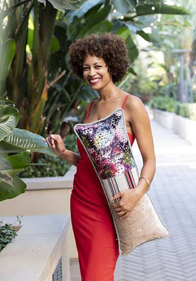
LETS MEET THE ARTIST cherise rollins!
At a young age Cherise learned that imagination and creativity are boundless. her Grandma Josie spent countless hours crafting with her at the kitchen table and nourished her creative spirit with new project ideas. she fell in love with the creation process arriving at a new destination in every project by using her creativity. Grandma Josie’s legacy empowered Cherise 5 years ago to move from Philadelphia to Los Angeles to make more space in life to honor her creative passions and purpose.
With a deep love for textiles, Cherise acted on a desire to make a different kind of pillow—oversized and bursting with colorful, mixed fabrics. After sewing the first one, I felt pure joy in having the artful expression in my home. I want to share that experience with others, helping us all create spaces that celebrate our individuality.
As a black woman, I tell my story in my own narrative through this art. My work is all about the beauty in diversity and in our differences. I believe in the power of self expression and art is our vehicle to share all that’s inside of us with the world.

christmas decor made simple!
check out this video explaining how to effortlessly decorate for the holidays that can stay up all season long!
I stumbled upon this House Tour with Designer Susan Burns of Susan Burns Designs and it is a great example of the how to build on the same elements used to design the home every day.
See how she uses natural materials for a simple and relaxed holiday decor scheme. Susan went for an organic approach using pine cones, greenery and fruit in place of glitzy decor. She started by trimming the Christmas tree with natural ornaments made of wood. Next, Susan created a rustic table centerpiece and dressed up the plate rack with fresh greens and a wreath. The dining room is kept simple with mini cypress trees, while the living room has hits of greenery and candles that glow with warmth. The porch is transformed into a cozy outdoor oasis complete with a garland wrapped around the railing and festive pillows and throws.